In a lesson earlier in the year we looked at the titles of films and how they're typography can create a feel for each film. We were then told to research into different typography ideas for our own Thriller. Here's the five I would have in our Thriller.

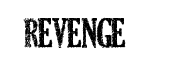
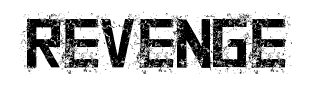
I like these first three because it's got quite a technology feel to the damage done to the writing. I feel these fit in well with our film that's based around teenagers as now a days peoples lives are centred around technology and we rely on it well, which many people would say damages our lives slightly as we don't experience everything we once did. It also damages our lives, especially as teenagers in the idea of things becoming bigger than needed, as demonstrated by the drama in our Thriller that relies on technology. All of the typography's I found are all centred around the same look because I really think these would fit in with our film.
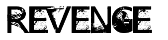
The fourth is a bit different to the other 3.The bold lettering isn't effected too much by the typography, instead it seems kind of smudged. I like this one as I think it stands out quite well, and has a dark sense to it as it looks like blood spatter/smudging. However I don't think it would fit into the idea of our films.
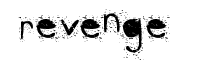
The last one I picked is very different to the rest, it still has a splatter kind of effect to it, but it is slightly more simple than the rest. I like the simplicity as I feel it doesn't over do anything and so stands out more than the first three. I also like the font of the writing as it's got a more innocent look to it, with a slight twist.
