In our film we used Greed by Howard Shore. To make sure it's not copyrighted we decided to use less than ten seconds making it okay to use. We also used TV background noises found on youtube, and radio background music during the less tense parts of the film. We also recorded the sound of one of our phones and added it into the film for text alerts.
|
I decided to look into what ratings Thrillers tend to get to have a sense of what audience we'd be setting ours for. I found that because Thrillers tend to have a lot of violence involved it tends to be rated 15-18 depending on how much is shown. In seeing this I thought our film would be rated 12 maybe 15 at most as there is minimal violence shown. This would open up the film to more of our target audience which were teens/pre-teens.
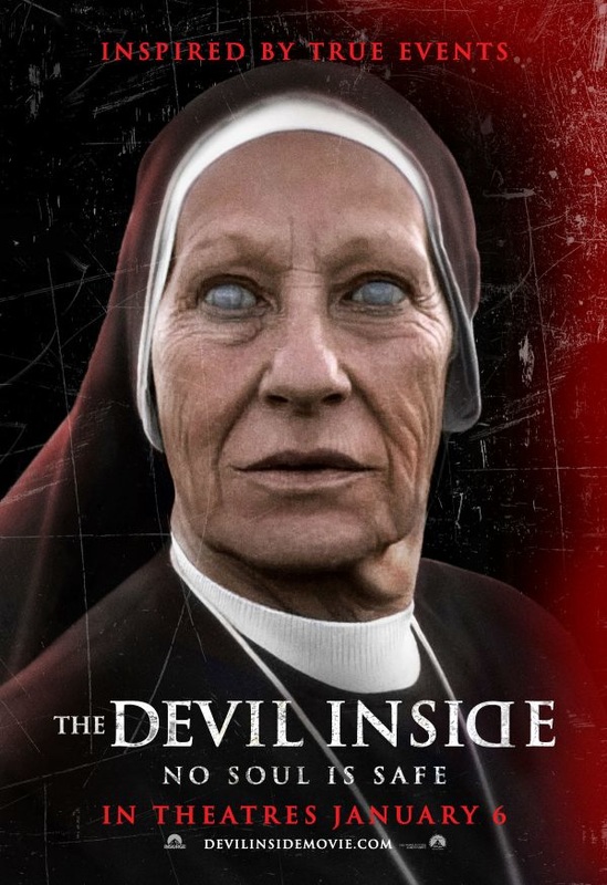
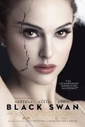
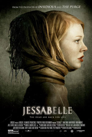
Before we started thinking of ideas for our Thrillers, I did a bit of research to see certain patterns I could find with different aspects of Thrillers. As I personally hadn't watched that many Thrillers before I decided to watch a few to get my head around them. In doing so I noticed a few similarities shown through the advertisement and posters for many Thrillers. The three I took personal interest into was The Devil Inside, Black Swan and Jessabelle. Once I finished watching these three films, I had a look at the posters each one had and realised they all have very similar traits. For example, the lighting in each focus's our attention on a close up of a main face/figure. This was the main character in each film, which means the posters are giving a glimpse of what's to come. Another example with the lighting is the grunge - like feel it gives to each posters, which is seen in many posters of Thrillers, signifying the feel of each film. The Devil Inside does however show some differences, where as the other two have fairly simplistic backgrounds The Devil Inside has scratch marks and a red streak across the poster, this draws people in I believe, because it is different to a typical poster where there's little bright colours. The Black Swan also has a slight difference in that the picture of the main figure is flawless and bright showing she's the centre off attention, however the slight crack shows something's wrong, which fits in with he film. The Jessabelle Poster is the most typical Thriller poster out of all 3, as it fits in with most of the conventions, however there is a slight difference in that two figures are shown to hint at the films story line. Overall, in seeing these posters and films I got more of a feel for the conventions of a Thriller, and knew what kind of ideas to put into my own piece. This was our story board we made before we started filming. It outlined our idea for our film, ready to actually start filming. Using this story board we made a shooting schedule to make sure we had kind of a check list as we went, although we didn't stick to either 100% as we came across problems and re-shoots we strayed a bit, but we picked it back up to make sure we had everything we needed. 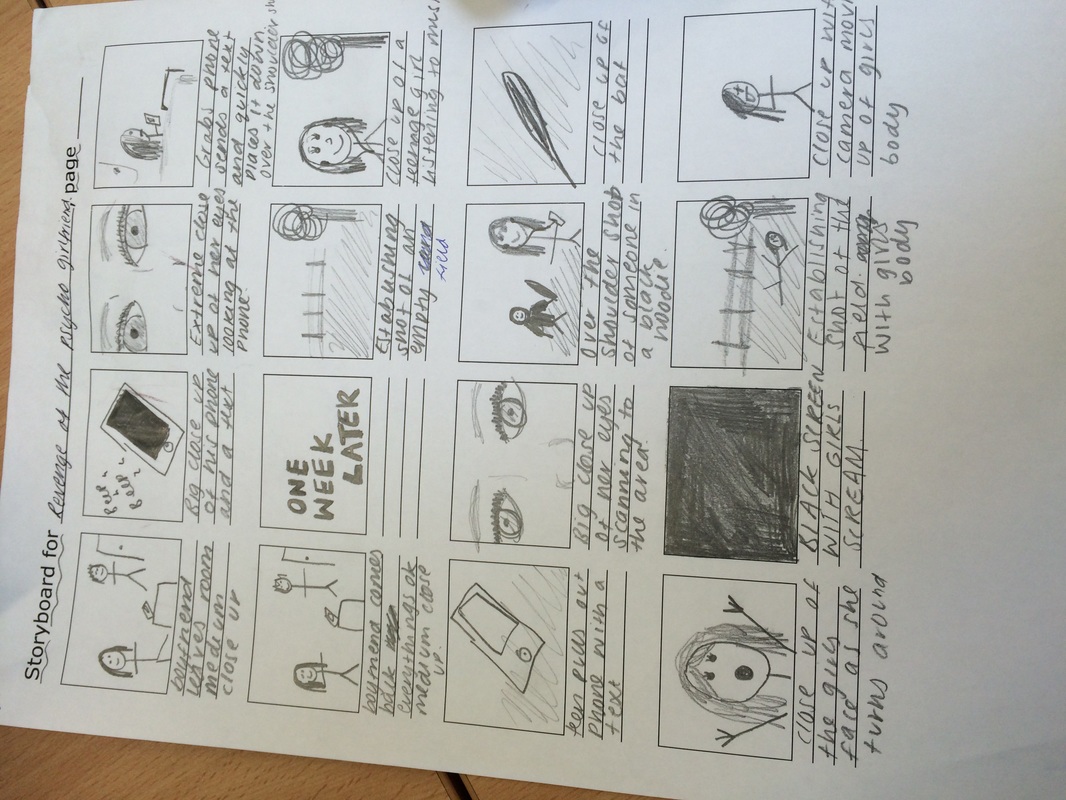 In a lesson earlier in the year we looked at the titles of films and how they're typography can create a feel for each film. We were then told to research into different typography ideas for our own Thriller. Here's the five I would have in our Thriller.    I like these first three because it's got quite a technology feel to the damage done to the writing. I feel these fit in well with our film that's based around teenagers as now a days peoples lives are centred around technology and we rely on it well, which many people would say damages our lives slightly as we don't experience everything we once did. It also damages our lives, especially as teenagers in the idea of things becoming bigger than needed, as demonstrated by the drama in our Thriller that relies on technology. All of the typography's I found are all centred around the same look because I really think these would fit in with our film.  The fourth is a bit different to the other 3.The bold lettering isn't effected too much by the typography, instead it seems kind of smudged. I like this one as I think it stands out quite well, and has a dark sense to it as it looks like blood spatter/smudging. However I don't think it would fit into the idea of our films.  The last one I picked is very different to the rest, it still has a splatter kind of effect to it, but it is slightly more simple than the rest. I like the simplicity as I feel it doesn't over do anything and so stands out more than the first three. I also like the font of the writing as it's got a more innocent look to it, with a slight twist.
This was the base of our script but we improvised a bit on the parts we forgot so it would run more smoothly and also have that realistic effect.
The first scene- Josh- i just need to pop to the toilet Tara- ok Second scene- Tara- Excuse me?… Excuse me do you know the time? Charli- Uh yeah its ten to three Tara- Sorry to bother you Charli- Oh no its okay, i've been stood up Tara- Oh sorry, who by? Charli- Dan Collins Tara- Oh i know him, are you a friend? Charli- His girlfriend Tara- I'm sorry what? Charli- I'm his girlfriend Tara- No no no he has a girlfriend and its not you Charli- I don't know what you're talking about Tara- Are you stupid? Charli- I can't be dealing with this (Charli walk away and tara pulls my hair) Me and Charli couldn't find a way to upload the footage, but speaking to other groups we found out it had happened before and our teacher sorted it for them so we thought we had to wait until tomorrow before getting that, but we then got on with looking for music to fit with out piece and starting editing a piece to fit. Once we finished that we still had a bit of time left to have a look around the cameras and figure it out. We decided to youtube how to get the footage from the camera and found how to do it, when we attempted it we realised it was going to take a while and the lesson was nearly over so decided to do it in our next lesson.
Our next lesson just happened to be our last chance before our deadline. So in this lesson we straight away got on to getting our footage off of the camera, when we did this we realised the footage was in the wrong format so had to convert it online to fit with Imovie. In doing so we managed to get what we wanted and started putting it together. We then realised there wasn't much time to get it all 100% finished so we decided I'll take it home and finish editing it before putting it on youtube for the group to use. Today we got an email from our teacher as he was on a conference saying the camera we needed was there ready for us to use. Me and Charli tried uploading the footage again but we couldn't, we realised this is because the footage was saved to the camera on the built in memory and so we decided to try again during lunch. At lunch we still couldn't figure out how to do what we wanted so me and Charli thought to wait until the lesson where we can get help as we really had no idea what to do.
Today we attempted to get our footage off of the memory card again, we asked our teacher for help but both of them were stuck too as we couldn't understand what had happened, we then realised we needed a certain camera to upload the footage from but it was being used at that moment. So as Charli had a lesson I volunteered to come up again in my free and try again. - Later in the day I went up to the classroom and the camera still wasn't there. So there was nothing I could do to help.
Today me and Charli looked over our footage and attempted to put our footage we filmed at her house onto IMovie, we discovered a problem as we couldn't get the footage off the memory card, we attempted for the majority of the lesson but it didn't go well, we decided to try again next lesson and work on our blogs for the rest of this lesson.
|