Before we started thinking of ideas for our Thrillers, I did a bit of research to see certain patterns I could find with different aspects of Thrillers. As I personally hadn't watched that many Thrillers before I decided to watch a few to get my head around them.
In doing so I noticed a few similarities shown through the advertisement and posters for many Thrillers.
The three I took personal interest into was The Devil Inside, Black Swan and Jessabelle.
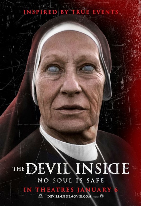
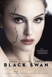
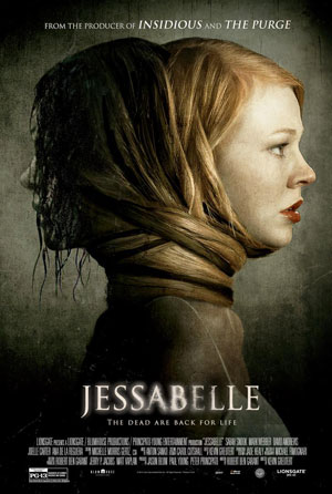
Once I finished watching these three films, I had a look at the posters each one had and realised they all have very similar traits. For example, the lighting in each focus's our attention on a close up of a main face/figure. This was the main character in each film, which means the posters are giving a glimpse of what's to come. Another example with the lighting is the grunge - like feel it gives to each posters, which is seen in many posters of Thrillers, signifying the feel of each film.
The Devil Inside does however show some differences, where as the other two have fairly simplistic backgrounds The Devil Inside has scratch marks and a red streak across the poster, this draws people in I believe, because it is different to a typical poster where there's little bright colours.
The Black Swan also has a slight difference in that the picture of the main figure is flawless and bright showing she's the centre off attention, however the slight crack shows something's wrong, which fits in with he film.
The Jessabelle Poster is the most typical Thriller poster out of all 3, as it fits in with most of the conventions, however there is a slight difference in that two figures are shown to hint at the films story line.
Overall, in seeing these posters and films I got more of a feel for the conventions of a Thriller, and knew what kind of ideas to put into my own piece.
In doing so I noticed a few similarities shown through the advertisement and posters for many Thrillers.
The three I took personal interest into was The Devil Inside, Black Swan and Jessabelle.
Once I finished watching these three films, I had a look at the posters each one had and realised they all have very similar traits. For example, the lighting in each focus's our attention on a close up of a main face/figure. This was the main character in each film, which means the posters are giving a glimpse of what's to come. Another example with the lighting is the grunge - like feel it gives to each posters, which is seen in many posters of Thrillers, signifying the feel of each film.
The Devil Inside does however show some differences, where as the other two have fairly simplistic backgrounds The Devil Inside has scratch marks and a red streak across the poster, this draws people in I believe, because it is different to a typical poster where there's little bright colours.
The Black Swan also has a slight difference in that the picture of the main figure is flawless and bright showing she's the centre off attention, however the slight crack shows something's wrong, which fits in with he film.
The Jessabelle Poster is the most typical Thriller poster out of all 3, as it fits in with most of the conventions, however there is a slight difference in that two figures are shown to hint at the films story line.
Overall, in seeing these posters and films I got more of a feel for the conventions of a Thriller, and knew what kind of ideas to put into my own piece.